If you are looking at real estate online to buy a new place or to compare your house to others already for sale you know that you are immediately attracted to some images, compelled to read further and see more images of that listing.
I find that interiors shot are the most appealing when choosing the right angle, the right light, the right atmosphere so they can induce the potential client to make an appointment with the agent, the first step leading to a transaction.
But of course images alone will not sell the house, you need to take further steps to make the experience pleasurable, more on that in a future post.
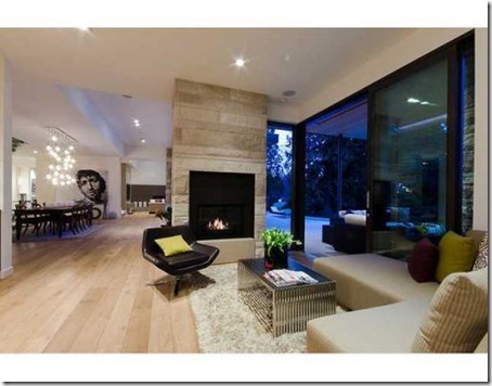
Let?s talk about presenting the house online, the above image shows a well presented room and you feel the space, it was most probably taken by a skilled photographer, but usually pictures are taken by the real estate agent, many times in a hurry, with a point and shoot camera, often not presenting the best features of your house.
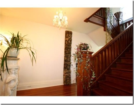
See what I mean? This house is listed today for $ 5,000,000, who took the picture?
And why was it part of the listing images?
What to do? Either you hire a professional interior photographer who preferably has also some experience in interior design and staging, like myself, or you can try your best in preparing the house before the real estate agent takes pictures.
Here are some tips because we know buyers want spacious homes or at least the sense of space in a great layout:
De-clutter
De-clutter more
1. Remove all items you will not need until you move to your next place, pack away most of books, family pictures, collections and in a word ?de-clutter?. You will be moving soon, hopefully, so why not simplify the process now giving away items, clearing closets and so on.2. Remove all rugs and keep the floor clear, that alone will make your rooms look larger in a picture.
Unidentified objects obstructing walkways, including a waste basket.
3. Arrange furniture so they don?t block views or passages and move to a storage too large pieces, table, sofa, chairs? pianos and laces?replacing them with smaller ones, this way you are really showing the square footage.Empty room
4. Strange but true an empty room looks smaller than it is, so try to fill an empty space with furniture you may have in other rooms or bring in items from a staging company.Darkness reigns!
5. Before pictures are taken turn on all the lights, open the drapes and let the light come in, every room will look more spacious and attractive.6. Last but not least?make the bed!
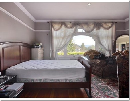
This is not the way to present your house? the last 2 no-no pictures I found on a real estate agent website, let?s not name names. Price listing for this house? $ 8,995,000? yes?almost NINE million dollars.
What were they thinking?
Another house, picture taken at a good angle, bed well done, a nice view, I would have lit the fireplace though!
Same house, pleasant living room, appealing to many viewers, no clutter, a great view and a lit fireplace!
Finally a few words for the exterior photographs and I am sure you will agree with me:
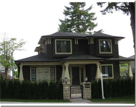
A nice house selling at $ 4,400,000 but a bit sad looking I think! I may be tempted to skip this listing?
Same price as above but don?t you see more appeal? I now would like to see the interior of this welcoming house.
I gave just a few examples of how to and how not to present a house with photographs for the online market, especially if the selling price is astronomical, but at any price range just a few clever adjustments can make a huge difference.
Did I make my point? So call me if you need my help!
Photography source
�2011 Brillante Interiors writes about new trends, timeless decor, iconic pieces, design ideas, or at times just musing about "a certain Italian way of doing things".
If you receive this post by Email and wish to leave a comment please click HERE and go to the comments section.
I love to hear from you!


ไม่มีความคิดเห็น:
แสดงความคิดเห็น